Access the Dashboard
-
In the AI for Process top menu, click Settings.
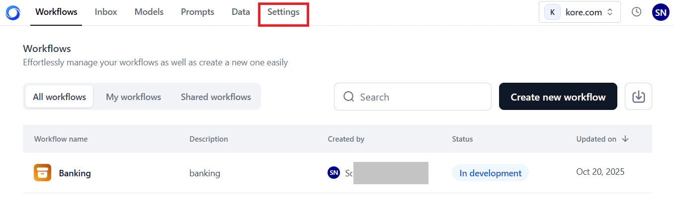
- On the left menu, select Monitoring > Analytics.
- Click the Workflows Analytics tab.
Key Metrics
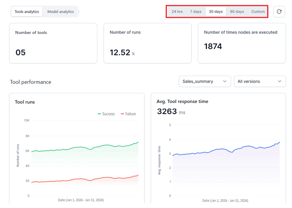
The dashboard displays account-level and workflow-specific metrics.Account-Level Metrics
These metrics summarize activity across all workflows in your account for the selected period.| Metric | Description |
|---|---|
| Number of workflows | Total deployed workflows, including all versions managed by all account users. To filter by workflow and version, use Workflow Performance Filters. |
| Number of runs | Total successful and failed runs across all deployed workflows. For status-specific counts, see the Workflow Runs widget. |
| Number of times nodes are executed | Event-driven execution counts for all node types. For node-level details, see the Nodes Execution widget. |
Hover over the i icon to view a summary for each metric.
Workflow-Specific Metrics
These metrics appear in the performance widgets for the selected workflow and version.- Workflow Runs: Success and failure trends for workflow runs.
- Avg. Workflow Response Time: ART to requests for the selected workflow version.
- Nodes Execution: Event-based execution graph for all node types. Executions are counted up to your account’s rate limit threshold.
Filter Dashboard Data
Use both filter types together to generate targeted analytics.Global Timeline Filters
Select the time period for all dashboard metrics from the top panel. The widgets update automatically.| Filter option | Description |
|---|---|
| 24 hours | Data for all hours in the past day. |
| 7 days | Data for all days in the past week (default). |
| 30 days | Data for all days in the past month. |
| 90 days | Data for all days in the past three months. |
| Custom | Select a day or date range from the calendar widget, then click Apply. |
| This Month | Data from the first day of the current month to today. |
| Last Month | Data for the entire previous month. |
| This Year | Data from January 1 of the current year to today. |
| Last Year | Data for the entire previous calendar year. |
- Select only current or past dates. Future dates aren’t supported.
- Data is available for up to one year from the current date.
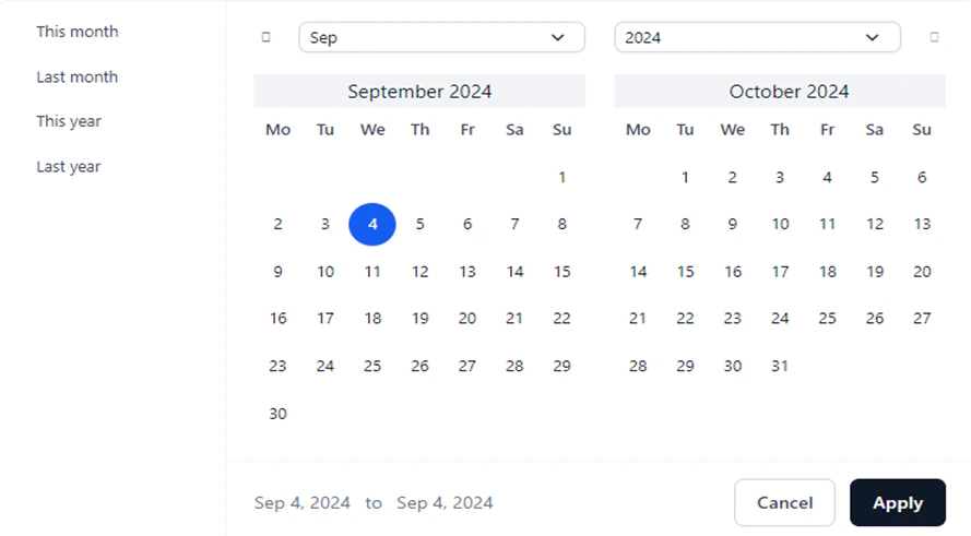
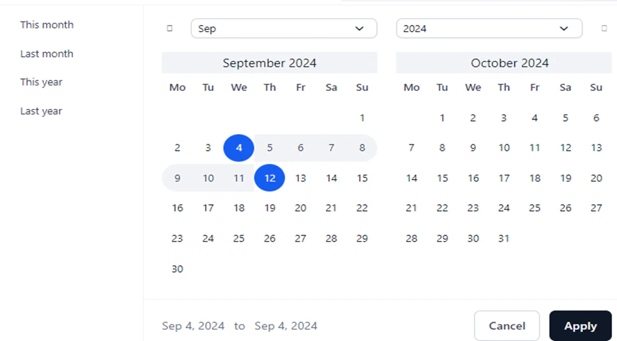
- Only consecutive dates are supported. Alternate or random date selections aren’t allowed.
- Multiple date range selections aren’t supported.
Workflow Performance Filters
These filters apply only to workflow-specific metrics and work alongside a global timeline selection.-
Workflow Name: Select a deployed workflow from the list.
If two workflows share the same name but were deployed at different times, they appear in the list with their respective deployment timestamps.
-
Workflow Version: Select a version of the chosen workflow. Use this to compare testing versus production versions.
If no versions exist for a workflow, the dropdown is empty. By default, data for all workflow versions is shown unless you select a specific version.
Performance Widgets
The dashboard has three widgets for workflow-specific metrics. To load data:- Select a date or date range using the Global Timeline Filters.
- Select a Workflow Name and optionally a Workflow Version using the Workflow Performance Filters.
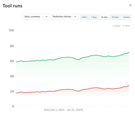
Workflow Runs
This widget shows successful and failed workflow runs as two line graphs for the selected period.- Y-axis: Total Number of Requests (auto-scaled).
- X-axis: Date.
- Successful runs appear in green; failed runs in red.
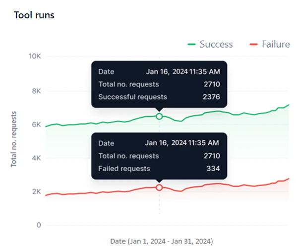
- Monitor success versus failure rates and identify failure patterns across the same or different dates.
- Identify peak and low performance periods across multiple date ranges.
- Detect sudden spikes in failures or performance drops with the hourly view.
- Compare performance across workflow versions.
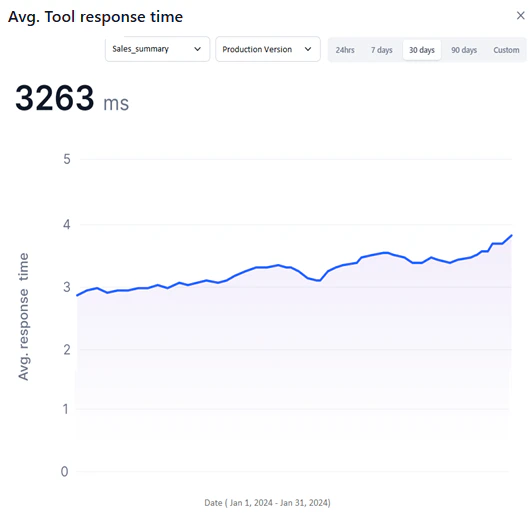
Avg. Workflow Response Time
This widget shows a line graph of the ART for each request the selected workflow version handles during the selected period.- Y-axis: Avg. Response Time (auto-scaled).
- X-axis: Date.
- A blue line represents ART values.
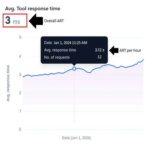
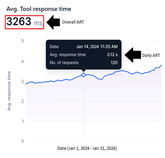
The system calculates the ART for all requests within each hour (hourly ART), combines these for each day (daily ART), then aggregates daily ART values across the selected date range to compute the overall ART.
- Identify bottlenecks by spotting sudden ART spikes that indicate delays or inefficiencies.
- Track optimization progress by monitoring ART trends before and after workflow changes.
- Compare ART across workflow versions to determine the most responsive option.
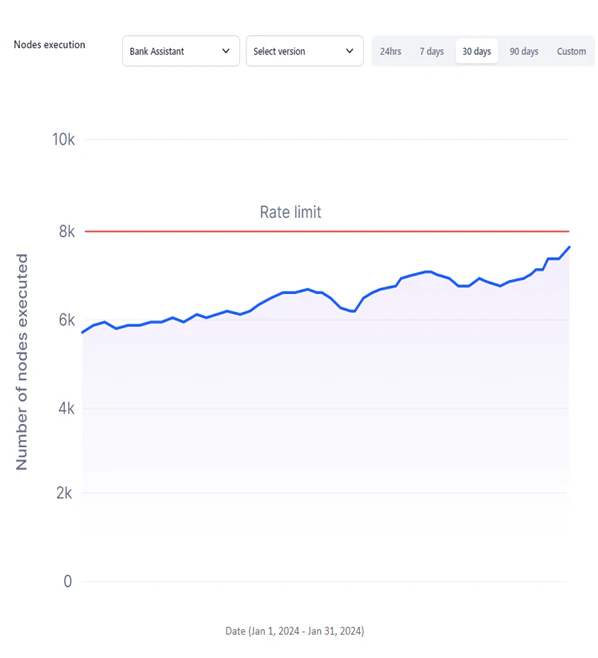
Nodes Execution
This widget shows a line graph of nodes executed per event run for the selected workflow version and period. For information about node types, see Nodes.- Y-axis: Number of Nodes Executed, fixed to the maximum rate limit for your account.
- X-axis: Date.
- A blue line represents node executions.
- A red line marks the maximum rate limit threshold.
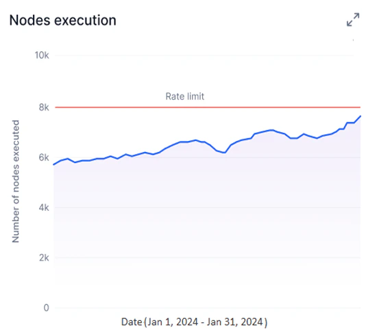
- Start Node
- AI Node
- Function Node
- Condition Node
- API Node
- DocSearch Node
- End Node
- Identify overused nodes or inefficient workflows by visualizing execution trends.
- Stay within subscription thresholds by tracking node executions against your rate limit.
- Detect bottlenecks and resolve workflow issues using node execution patterns.
Expand a Widget
Expand any widget for a drill-down view with its own Global Timeline and Workflow Performance filters. To expand a widget, hover over its top-right corner and click the double-arrow icon.